As we are all currently homebound with no sports in the foreseeable future, what are we to do with our time? You can only binge watch Netflix for so long until you realize that you haven’t showered in days, you don’t know what time it is, or what day it is for that matter. You look at Instagram for the umpteenth time, only to confirm that everyone is doing exactly what you are. Nothing. So in the effort to try and occupy our time, minds and fulfill the void that hockey once occupied, I shall share what will hopefully be some enlightening hockey reading material on non current hockey happenings, since, well, there are no current happenings.
While we might not be able to wear our favorite sweaters to watch our boys play, there is nothing stopping anyone from throwing on their jerseys in an attempt to lift your spirits. Actually, I highly suggest it. I’m sporting mine right now, and I already feel better. We all have our favorite jerseys, but throughout hockey’s history there have been a lot of bad jerseys that deserve some recognition. For the sake of tidiness, we will keep it to five worst.
5. Vancouver Canucks 1978-85:
They really worse these for seven seasons? I feel like this jersey should be made of velvet and embroidered with sequins because rather than a hockey uniform, it reminds me of something that a ballerino (that’s masculine for a male ballerina) would wear leaping across the stage. Tchaikovsky anyone?
4. Phoenix Coyotes 1998-2003 Third Jersey:
It might be hard to believe, but I feel bad ragging on the Coyotes, I mean, what have they ever really done to anyone? Literally nothing, so rather than harp on them, I will let the jersey simply speak for itself.
3. LA Kings 1995-96
They actually made Wayne Gretzky wear this? Just because they are the Kings does not mean the team’s logo should evoke Burger King. Even when you go to Burger King, you know it is a bad decision.
2. Mighty Ducks of Anaheim 1995-1996:
Ok, I love the movie The Mighty Ducks, and I suppose I can’t balk that it inspired an entire franchise that hopefully acquired more hockey lovers in the area where beach volleyball is more alluring than hockey. I’m all for spreading the love of hockey. However, I have to draw the line with the direct link for grown players to be modeled after a 1990’s kid’s movie. Its akin to the plot line of D3. The Ducks (Team USA) have won the Junior Goodwill Games in D2 and are considered world champs, but when they enter D3 their new competition is the varsity team. It doesn’t make sense, and neither do these jerseys.
Granted, in current years, they have distanced themselves from their origins, but are they really doing any better with their new get up? Makes me think that we should all go trick-or-treating. Maybe Getzlaf gives out full sized candy bars.
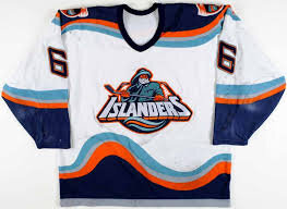
1. New York Islanders 1995-97:
Artistically speaking, this might not be the worst, but it comes in at number one for the sole fact that it resembles Gordon’s frozen fish sticks. It was so bad that it had their rival fanbase of the New York Rangers taunting the Islanders with the chant “We want fish sticks”. It even went so far as to inspire an entire book entitled “We Want Fish Sticks: The Bazaar and Infamous Rebranding of the New York Islanders”. Actually, after looking at this I do kind of want fish sticks, with ketchup. I realize that sounds gross, but that’s just how bad and those jerseys are.
In case you hadn’t noticed, the top three all were from the ’95 season, clearly the mid nineties poor fashion transcended into the hockey arena as well.
While I have to admit, those are some bad jerseys, so bad that in fact I kind of like them. There is something to be said about an ugly hockey sweater, it holds a lot of character. If anything, it’s a conversation starter.
Now, there is one jersey that you may have been thinking that I have missed, but fear not, I purposely didn’t even rank it because it is in a category all it’s own. The Minnesota Wild. I understand it was devastating when the Minnesota North Stars left, but how you can go from the kick-ass logo that the North Stars had, to the current Christmas colored bear is beyond me. In fact, next Christmas when I go to an ugly sweater party, I should just wear this jersey.
In case you were wondering, today is Saturday (I think), and since we can’t be discussing potential playoff scenarios, let’s all dawn our favorite jerseys, the uglier the better, crack open a beer, a La Croix or a soda (maybe even make some fish sticks) and see what kind of hockey flicks we can watch. I clearly have already watched the Mighty Ducks trilogy as I was obviously well versed in the plot points, and I suggest you do the same. Or perhaps Goon or Slap Shot. Until we can convene on some actual hockey news, let’s at least have some fun.


